
Since the gallery was to exhibit a variety of different forms of art, I decided to choose works from a sculptor and a painter to inspire my design of the gallery. Ben Smith is a young emerging Australian artist whose paintings focus on semi anthropomorphic animal interactions. This painting, entitled ‘the voyage for direction’ is one of my favourites. Alasdair MacIntyre is also an Australian based artist, his work is essentially sculptured miniature political cartoons. I liked the simplicity of the form and the honesty of the characters in the work, this piece is entitled ‘Marooned’ and is one of his most recent pieces.
From the artwork themselves I found a few concepts that I wanted to work with. Firstly was the idea of reflection, I liked the way that in both pieces the characters in the work had a reflection of themselves. I wanted the gallery to also have this reflective quality to it, offering new and different ways of viewing the art work. The other concept that I took from the selected artwork was that of water. Apart from its reflective properties I also wanted to explore the notion of rippling waves in the water. My initial concept had several sets of concentric circles all interwoven, like rain falling on a pond, but this created very awkward wall junctions and spaces and I eventually simplified this idea into one drop of water with ripples radiating out.
My last concept that heavily influenced the design was that I not only wanted the space to be a gallery, but it was also to be a cafe. This, in my opinion, would fit better with the Newtown site, allowing anyone to come in off the street, wonder around, have something to eat or drink and discuss the art, then perhaps purchase something on the way out. This concept was to give the gallery a more relaxed feeling, and to tie in better with the site.


.jpg)
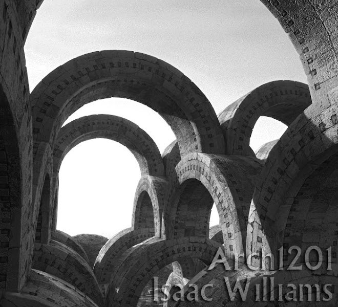


 This image shows the skylight system for the exhibition space, as well as the rooving.
 The gallery fits into the site, addressing King St, and also the rear lane access.
 Elevated view from King St.
 Elevated view from, the rear laneway showing the car port and roof system.
 The central courtyard and progression of spaces.
 The King St. facade.
  The sculpture courtyard is the focal point of the entire gallery space, and this is why I chose it as the component to show in detail. The centre of the space features a reflective platform for a large sculptural centre piece, but this platform can be removed and be replaced by a water feature when it is unoccupied. The courtyard is covered in large grey tiles and features the cafe and seating area, as well as the large curved staircase up to the walkway.
 The sections and elevation illustrate the progression of spaces and their separation by the courtyard. Section 1 shows the double height of the entry space, while Section 2 illustrates the skylight system used in the main exhibition space.
 The plan is perhaps the most illustrative view of the concept of rippling water. The focus of the gallery is on the circular courtyard, and the surrounding spaces and their rooving echoes this idea of concentric circules.
 The studio apartment is located on the second story and is accessed via the stairs form the carport. It is very open plan and has a built in kitchenette and bathroom, but also allows very easy access to the kitchen on the first floor, and also to the office. The second level gallery is the largest of the gallery spaces and is used for longer term exhibitions. The walk way allows for a greater angle of view for the sculpture courtyard and is accessed by a slightly oversized curved staircase from the courtyard.


 With this space light has to enter each different room in a different way, the light has to draw the viewer to different areas of the house as he constantly searches for different views. The main views are either fragmented or just out of sight and should be seen through glass, like the lens of a camera. There needs to be a certain ambiguity about the levels of the house, as there is an ambiguity about the levels in hoppers painting.


